Exchange Rate Essentials Your Complete 2025 Guide

Cryptocurrency markets move fast, but they are not random. Behind every breakout, pullback, and consolidation, there’s a readable story etched into crypto charts. These visual maps of price and volume transform a chaotic stream of trades into patterns you can learn, interpret, and act on. Whether you’re day trading Bitcoin, swing trading altcoins, or building a long-term DeFi portfolio, understanding crypto charts helps you filter noise, time entries and exits, and manage risk with more clarity. In this guide, we’ll explore the anatomy of crypto charts, the core indicators professionals rely on, the nuances of different time frames, and the practical routines that turn analysis into results. By the end, you’ll be able to look at a chart and quickly recognize trend, momentum, and probable scenarios—without getting lost in jargon or over-optimization.
Table of Contents
ToggleWhat Are Crypto Charts and Why They Matter
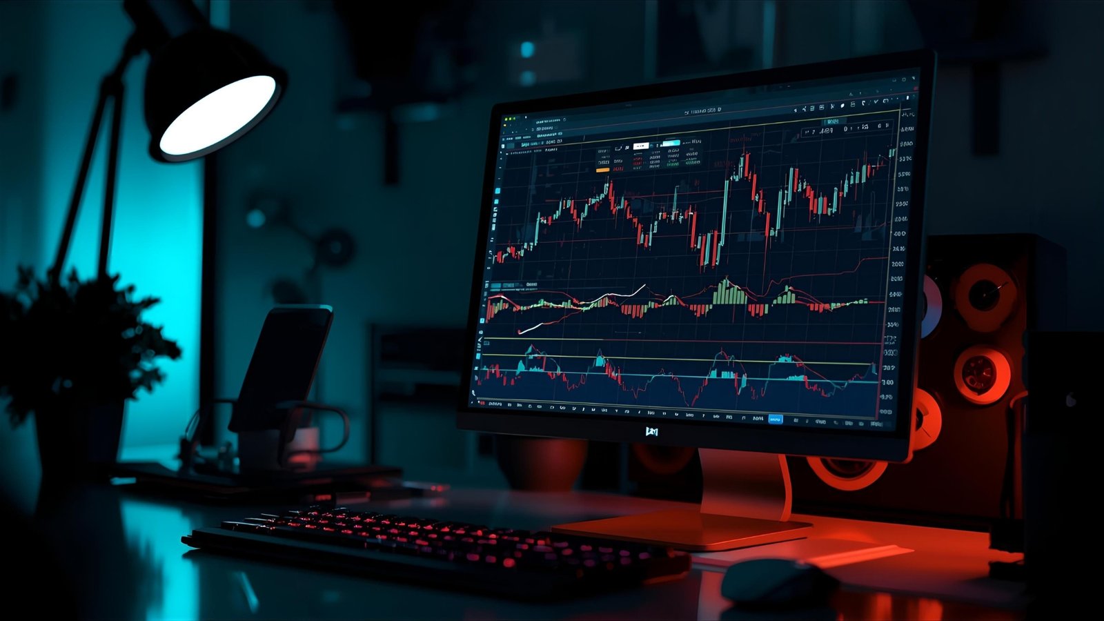
Crypto charts are visual representations of price action and trading activity over time. They condense the raw order flow into readable signals: open, high, low, close, and often volume. Most charting platforms let you switch between candlestick, line, and bar styles, apply indicators, draw trendlines, and mark support and resistance. Those tools turn the market’s heartbeat into a dashboard you can scan in seconds.
The reason crypto charts matter is simple: market participants share human biases—fear, greed, impatience—that repeat. Price patterns reflect these emotional cycles. When you learn to read crypto charts, you’re not predicting the future; you’re identifying higher-probability outcomes based on how crowds have behaved in similar contexts. That edge, paired with discipline, is often the difference between consistent growth and random swings of fortune.
The Core Building Blocks of Crypto Charts
Candlesticks: The Language of Price
Candlesticks are the most popular format for crypto charts because they convey more information at a glance. Each candle shows four values: the price at open, the highest and lowest ticks, and the closing price for a chosen period. A solid rise with a small wick suggests decisive buyers; a long upper wick hints at rejection. When you study candlestick patterns, you start recognizing subtle shifts in power—engulfing candles that flip momentum, doji that signal indecision, and pin bars that mark potential reversals when they appear at key levels.
Time Frames: Context Is Everything
A chart is only as useful as the time frame you select. A five-minute chart highlights microstructure; a daily chart reveals the prevailing trend; a weekly chart filters noise and exposes the market’s backbone. Professionals use a top-down approach: start from the higher time frame to define context, then drill down for precise entries. When analyzing crypto charts, the habit of aligning multiple time frames reduces false signals and keeps you from fighting the dominant tide.
Volume: The Fuel Behind the Move
Price without volume is suspect. Rising prices on falling volume can mean a tired rally; breakouts on surging volume point to conviction. Some traders layer in volume profile to visualize where the most trading occurred—these high-volume nodes often act as magnets or barriers on crypto charts. When volume swells at a key breakout level, it often confirms that funds and larger players are active, not just retail enthusiasm.
Drawing Support, Resistance, and Market Structure
Mapping Levels That Matter
Clean support and resistance levels are the skeleton of crypto charts. Support is a price area where demand historically absorbed supply; resistance is where sellers overwhelmed buyers. These zones are not single lines but regions. The more times price respects a level, the more meaningful it becomes. When price breaks cleanly with follow-through and closes beyond a level on higher time frames, the role often flips—old resistance becomes new support. This simple principle powers countless strategies.
Trendlines and Channels
Trendlines connect higher lows in uptrends or lower highs in downtrends. They make the trend visible, and when combined with parallel lines, form channels that frame price action. Breaks of well-respected trendlines on crypto charts can signal momentum shifts, especially when they coincide with volume surges or momentum divergences. A channel that narrows into a wedge often precedes an expansion in volatility—either a continuation or a reversal depending on context.
Market Structure and Liquidity
Market structure describes the rhythm of highs and lows. In a healthy uptrend, price makes higher highs and higher lows; in downtrends, the opposite. When crypto charts print a lower low after a series of higher lows, that’s a structure break that deserves attention. Many traders also consider liquidity—clusters of stop orders just beyond obvious levels. Price often sweeps these areas before moving toward its true destination. Recognizing these behaviors helps you plan entries and avoid emotional whipsaws.
Indicators That Earn Their Place on Crypto Charts
Moving Averages: Trend and Slope
Moving averages smooth price and reveal direction. The 20-period highlights short-term rhythm, the 50-period captures swing trends, and the 200-period frames the long-term bias. On crypto charts, the slope matters as much as position. A rising 50 above a rising 200 signals a strong base trend; flattening slopes warn of transition. Crossovers can be useful, but they lag; use them alongside structure and volume rather than in isolation.
RSI and Momentum Oscillators
The Relative Strength Index (RSI) measures the speed of price changes on a scale from 0 to 100. Overbought and oversold levels can help time rotations within a trend, but the real power lies in bullish and bearish divergences—when price makes a new extreme but the oscillator does not. On crypto charts, sustained RSI above 50 in uptrends or below 50 in downtrends often reinforces the dominant bias.
MACD and Trend Confirmation
MACD compares two moving averages and plots a signal line. Crossovers and histogram expansions can confirm momentum shifts already hinted at by structure and volume. When MACD turns up from below zero and price reclaims a broken level, the confluence strengthens the setup. As with all tools on crypto charts, avoid treating MACD as a trigger by itself; it works best as confirmation.
Fibonacci Retracement and Extensions
Many traders map Fibonacci retracement levels—38.2%, 50%, 61.8%—to anticipate where pullbacks might end. When these levels align with prior structure, trendlines, or moving averages, they become magnets for bids or offers. On crypto charts, a clean retrace to the 61.8% followed by a strong reversal candle is a classic continuation signature, especially within a strong trend.
Reading Different Chart Types for Clarity
Candlestick vs. Heikin Ashi
Standard candles show each period’s battle in detail. Heikin Ashi smooths the view by averaging data to visualize trends with fewer whipsaws. In trending markets, Heikin Ashi prints long same-color runs that help you sit through noise. In choppy ranges, standard candles reveal wicks and failed pushes more precisely. Switching between the two on your crypto charts can reduce overreactions and clarify bias.
Line Charts for Big-Picture Structure
A simple line chart plots closing prices and often cleans up messy wicks. When your candlestick view feels noisy, flip to a line chart and redraw support and resistance. This habit forces you to focus on structure and ignore over-detailed intraperiod swings that don’t affect your plan.
Building a Repeatable Process Around Crypto Charts
Top-Down Analysis
Start weekly to define the macro trend and key levels, shift to daily for actionable zones, and finish on the four-hour or one-hour for entries. This progression aligns your trade with the prevailing current. On crypto charts, the biggest mistakes come from zooming in too far, too soon—forming opinions on a five-minute squiggle that runs straight into a daily wall you never saw.
Confluence Over Single Signals
A single candle pattern or indicator cross is fragile. Confluence—multiple reasons pointing in the same direction—improves odds. A bounce at a prior demand zone that also aligns with a rising 50 MA and an RSI hold above 50 is more compelling than any one factor alone. Train your eye to stack evidence on crypto charts without forcing it; if the ingredients aren’t there, move on.
Entry, Risk, and Exit Rules
Your read on crypto charts becomes profitable only with defined rules. Decide where your thesis is wrong before you enter, and place a stop there. Position size so a normal loss is small relative to your account. Predefine at least one target—often the next resistance or a measured move from the pattern—and consider taking partial profits, then trailing a stop below higher lows. Consistent execution matters more than any single analysis trick.
Patterns That Repeat Across Crypto Charts
Breakouts and Retests
A classic behavior: price compresses under resistance, breaks out on strong volume, then returns to “kiss” the level from above. That retest often offers a low-risk entry with the trend, as long as the level holds and volume doesn’t die. On crypto charts, failed retests—where price loses the level and closes back below—warn you to step aside.
Ranges, Accumulation, and Distribution
Sideways ranges are where positions are built and unloaded. Look for subtle tilts: higher lows pressing against flat resistance can signal accumulation; lower highs sagging into support hint at distribution. Volume can validate the read. When a well-defined range finally breaks with a weekly close, the subsequent move can travel the height of the range—or more.
Trend Continuation After Pullbacks
In strong trends, the first clean pullback to a rising 20 or 50 MA often attracts buyers. If the pullback forms a bull flag—a downward-sloping consolidation after a sharp rise—the measured move targets the prior leg’s length projected from the breakout. On crypto charts, continuation patterns usually work until they don’t; once a pullback morphs into a deeper correction with lower lows, respect the shift.
Adapting Crypto Charts to Different Trading Styles
Day Trading and Scalping
Short-term traders live on the one-minute to fifteen-minute spectrum, but the best still anchor to higher time frames first. They look for liquidity sweeps, VWAP reactions, and micro order flow clues. On intraday crypto charts, volatility is both friend and foe. Quick invalidation and strict risk caps matter. Momentum bursts around market opens, major economic prints, or exchange-specific funding events can create brief but powerful windows.
Swing Trading and Position Trading
Swing traders focus on four-hour to daily crypto charts, aiming to capture multi-day legs. Entries often come after a breakout retest or a pullback into structure with momentum turning up. Patience is an edge; the best swings need time to unfold. Position traders think even bigger—weekly trends, macro cycles, on-chain metrics—and tolerate wider stops in search of larger moves.
Long-Term Investing
Investors use crypto charts to improve average entry price, scale in during multi-month bases, and avoid obvious euphoria tops. They combine technicals with fundamentals: network adoption, active addresses, fee revenue, developer traction, and macro liquidity. If you plan to hold for years, charts help you avoid paying peak sentiment and encourage buying when fear is elevated and bases are forming.
On-Chain and Off-Chain Data: Enriching Crypto Charts
Traditional indicators read price and volume alone, but on-chain metrics add context unique to crypto. Exchange inflows and outflows, realized profits and losses, and long-term holder activity can hint at supply pressure or conviction. When on-chain data aligns with what you see on crypto charts—for instance, dwindling exchange balances during a breakout—the narrative strengthens.
Off-chain, watch macro cues: interest rates, dollar strength, and risk appetite influence all speculative assets. A rising dollar and tightening liquidity often cap crypto rallies; easing conditions support them. Your crypto charts will reflect these forces, but knowing the backdrop helps you judge when to push and when to stay defensive.
Avoiding Common Pitfalls in Chart Analysis
Indicator Overload
It’s tempting to cover crypto charts with every tool available. More lines rarely mean more clarity. Choose a small set you truly understand—structure, volume, one or two momentum measures—and master their interactions. When in doubt, remove rather than add.
Forcing Patterns
Humans see shapes everywhere. If you’re hunting for a head and shoulders or a cup and handle, you’ll find one—even when it’s not actionable. Let price reveal the pattern naturally and insist on confirmation, especially around key support and resistance.
Ignoring Risk When You’re Right
Many traders plan for being wrong but not for being right. Without exit rules, winners turn into round trips. On crypto charts, clear targets and trailing mechanisms convert good reads into realized results. Celebrate perfect exits less and consistent process more.
Practical Workflow: From Scan to Execution
Daily Routine That Scales
Begin by scanning the weekly and daily crypto charts of assets on your watchlist. Mark the closest meaningful levels above and below price. Note the trend state—up, down, range—and whether momentum supports it. Drop one level lower to refine entry zones. If nothing lines up, walk away. Great trades are rare; mediocre trades are everywhere.
Journaling and Feedback Loops
Save screenshots before and after trades. Annotate what you saw, why you entered, and how you managed it. Over time, your journal becomes a private textbook of market lessons, tailored to your temperament. Patterns emerge—setups you consistently read well, environments where you struggle. Your crypto charts will teach you if you let them.
Tools and Platforms for Charting
Quality platforms let you set alerts, layer indicators, draw precisely, and sync across devices. Look for clean execution, historical data depth, and reliable uptime. Since crypto trades 24/7, alerts that ping you when price hits a level or an indicator crosses can prevent screen fatigue. Whatever platform you choose, keep your crypto charts simple, your annotations clear, and your templates consistent.
Ethics, Security, and the Human Factor
Charts don’t exist in a vacuum. Protect your accounts with strong security, hardware keys where possible, and careful API permissions if you connect bots. Respect market integrity. Avoid echo chambers where overconfidence grows unchecked. The best analysts admit uncertainty and wait for confluence rather than forcing trades. Your mindset shapes how you read crypto charts as much as your tools do.
Bringing It All Together
Reading crypto charts is a craft. It blends structure, momentum, volume, and context into a narrative you can act on. You won’t master it in a weekend, but the principles are learnable, repeatable, and robust across market cycles. Keep your process lean. Focus on levels, trends, and confirmation. Protect your downside. Over time, you’ll feel the shift—from reacting to candles to anticipating behavior around key zones with calm, disciplined confidence.
Conclusion
Crypto charts transform market noise into usable information. By learning candlesticks, marking support and resistance, aligning time frames, and relying on a small, coherent set of indicators like moving averages, RSI, MACD, and Fibonacci, you build a practical edge. Add volume context, respect market structure, and demand confluence. Whether you trade intraday spikes or invest through multi-month bases, the same foundations apply. Let crypto charts guide your timing, shape your risk, and reinforce your discipline. In a 24/7 market where emotions run hot, charts are your cool-headed partner—if you keep them simple and your process consistent.
FAQs
What is the best time frame for analyzing crypto charts?
There isn’t a universal best time frame; it depends on your style. Day traders prefer one to fifteen minutes for entries but still anchor to hourly and daily context. Swing traders rely on four-hour and daily crypto charts, while investors emphasize daily and weekly to filter noise.
Which indicators should beginners start with on crypto charts?
Begin with moving averages to see trend, RSI for momentum, and volume to confirm moves. Add MACD once you’re comfortable. Keep your crypto charts uncluttered and prioritize structure and levels over indicator stacks.
How do I know when a breakout on a crypto chart is real?
Look for a strong close beyond the level on higher time frames, rising volume, and—ideally—a successful retest that holds as new support. If price immediately slips back under the level with weak volume, the breakout may be false.
Are candlestick patterns reliable for crypto charts?
Candlestick patterns are context tools, not standalone signals. A bullish engulfing candle at multi-day support with rising volume carries weight; the same candle in the middle of nowhere means little. Combine patterns with trend, levels, and momentum for better reliability.
How can I avoid overtrading when using crypto charts?
Define strict criteria for setups, set alerts at key levels, and journal trades. If your crypto charts don’t show confluence, do nothing. Fewer, higher-quality trades typically outperform frequent, impulse-driven decisions in the long run.
Also Read : Best Currency Exchange Rates Near Me Save More